 Amnish Singh Arora
This week, I looked into Docusaurus, one of the best tools to generate a beautiful documentation site in no time. Known for its simplicity and ease of use, it provides a clean and modern design, search functionality, and focuses on creating an easy to maintain documentation for developers. No wonder it has a thriving community.
In this post, I'll be sharing my code reading results for one of the features I would like to implement in my own site-generation project.
Table of Contents
1. Feature - TOC
2. Reading the docs 📘
3. Looking at the code 💻
4. Finding implementation for TOC
5. Conclusion 🎇
Feature - TOC
The feature I'll be talking about is a common but a really handy utility. Apart from grouping various related documents into a comprehensive navbar on the left, every page on a Docusaurus generated site can be configured with Table of Contents. Since it allows the readers to skim through large pieces of writings, it is a must-have on any platform that publishes readings.
Reading the docs 📘
I started my research by looking through the official docs that go through different types of TOCs and how a TOC can be configured.
The docs talked about 2 types of TOCs - the one that is always there on the right side, and an inline version you can have at the top.
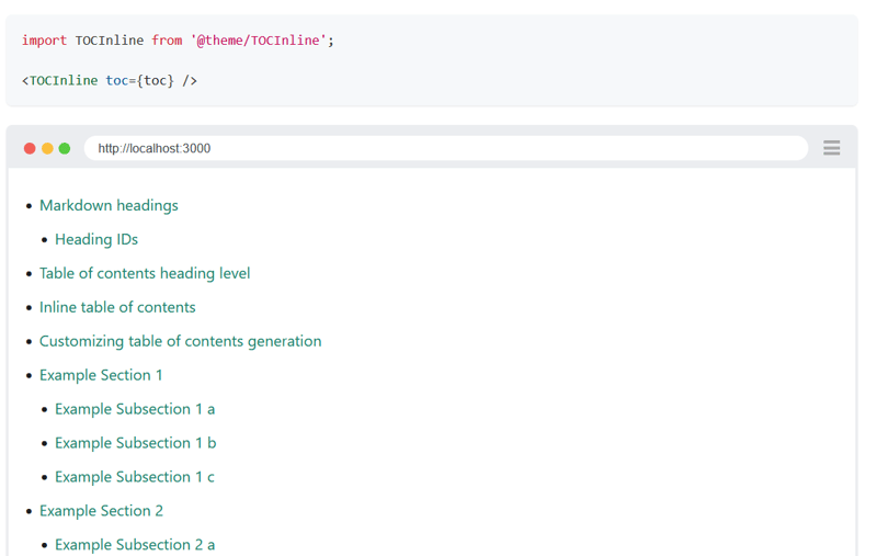
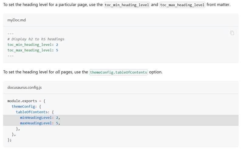
I also noticed some interesting features, that allow users to configure their TOCs - in either the document itself or in the docusaurus config file.
Looking at the code 💻
After going through any docs concerning TOCs, I decided to dive into the actual code to get a sense of how I could add a similar feature to my project.
Since its way easier to inspect code in an IDE compared to Github, I forked the repository and cloned my copy on the system.
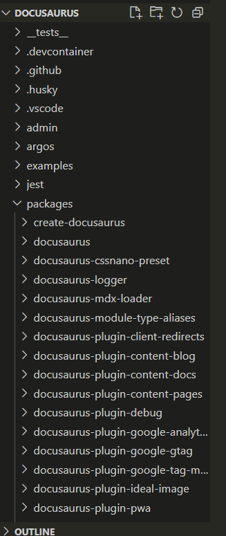
I took a quick glance at the file structure and was stunned by the project's sheer size and level of complexity. All the major building blocks were isolated in their own separate packages, essentially making the project a collection of smaller projects.
Finding implementation for TOC
After randomly opening folders to get a basic idea of how everything was organized (with little success), I realized the only option was to start reading with a goal.
1. Finding a lead
The very first thing I had to figure out was where to start looking in the massive file structure I just witnessed. In other words, I needed a keyword that would lead me to the correct files.
This part is sometimes really easy when you have a UI to inspect at your disposal. I opened the browser tools and started looking at the TOC html.
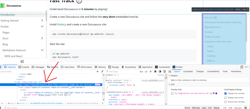
As expected, I found a class name "tableOfContents" that could easily lead me to the files and code I was looking for.
2. Using the keyword to search
Putting faith in the class name I had found, I immediately put it in my VSCode search bar to see how close I could get with it.
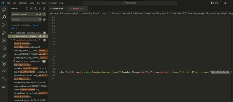
And lucky me, I found exactly what I was looking for. I found all the implementation files, and even tests related to the feature in the first attempt.
Link to tests: https://github.com/facebook/docusaurus/blob/main/packages/docusaurus-theme-classic/src/__tests__/options.test.ts
The config files are in the generated project itself.
3. Making sense of the code found
Now it was time to dive into those files, and get an idea of how things were done.
The first thing I found was the well-designed schema for configuring the project's theme, and TOC was a part of it.
docusaurus/packages/docusaurus-theme-classic/src/options.ts
export const DEFAULT_CONFIG: ThemeConfig = {
  colorMode: DEFAULT_COLOR_MODE_CONFIG,
  docs: DEFAULT_DOCS_CONFIG,
  metadata: [],
  prism: {
    additionalLanguages: [],
    theme: defaultPrismTheme,
    magicComments: [
      {
        className: 'theme-code-block-highlighted-line',
        line: 'highlight-next-line',
        block: {start: 'highlight-start', end: 'highlight-end'},
      },
    ],
  },
  navbar: {
    hideOnScroll: false,
    items: [],
  },
  tableOfContents: {
    minHeadingLevel: 2,
    maxHeadingLevel: 3,
  },
};
Not only this, I found various react components for different types of TOCs (sidebar and inline).
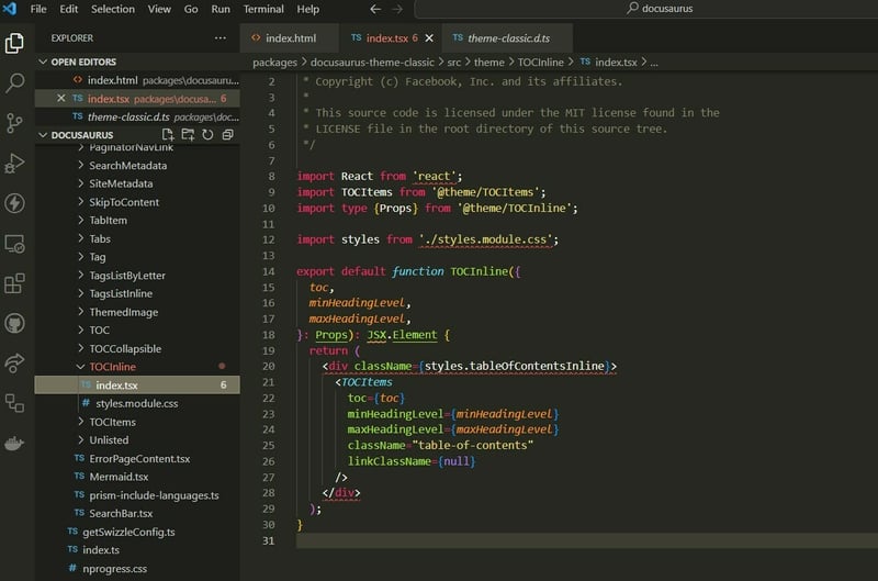
Since I was planning to implement an inline TOC (although logic for all types would be similar only styling differs), I opened the TOCInline component.
docusaurus\packages\docusaurus-theme-classic\src\theme\TOCInline\index.tsx
Now that I found the meat, it was time to follow the arrows.
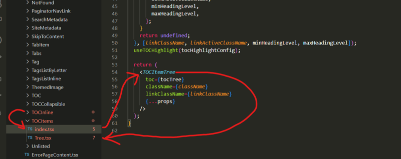
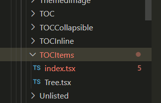
Apparenty, all different types of TOCs (sidebar, collapsible, inline) were just a wrapper to a more generic component containing the core TOC logic and html TOCItems.
docusaurus\packages\docusaurus-theme-classic\src\theme\TOCItems\index.tsx
export default function TOCItems({
  toc,
  className = 'table-of-contents table-of-contents__left-border',
  linkClassName = 'table-of-contents__link',
  linkActiveClassName = undefined,
  minHeadingLevel: minHeadingLevelOption,
  maxHeadingLevel: maxHeadingLevelOption,
  ...props
}: Props): JSX.Element | null {
  const themeConfig = useThemeConfig();

  const minHeadingLevel =
    minHeadingLevelOption ?? themeConfig.tableOfContents.minHeadingLevel;
  const maxHeadingLevel =
    maxHeadingLevelOption ?? themeConfig.tableOfContents.maxHeadingLevel;

  const tocTree = useFilteredAndTreeifiedTOC({
    toc,
    minHeadingLevel,
    maxHeadingLevel,
  });

  const tocHighlightConfig: TOCHighlightConfig | undefined = useMemo(() => {
    if (linkClassName && linkActiveClassName) {
      return {
        linkClassName,
        linkActiveClassName,
        minHeadingLevel,
        maxHeadingLevel,
      };
    }
    return undefined;
  }, [linkClassName, linkActiveClassName, minHeadingLevel, maxHeadingLevel]);
  useTOCHighlight(tocHighlightConfig);

  return (
    <TOCItemTree
      toc={tocTree}
      className={className}
      linkClassName={linkClassName}
      {...props}
    />
  );
}
And finally, I was led to the TOCItemsTree component which was the first piece of code that made my jaws drop.
docusaurus\packages\docusaurus-theme-classic\src\theme\TOCItems\Tree.tsx
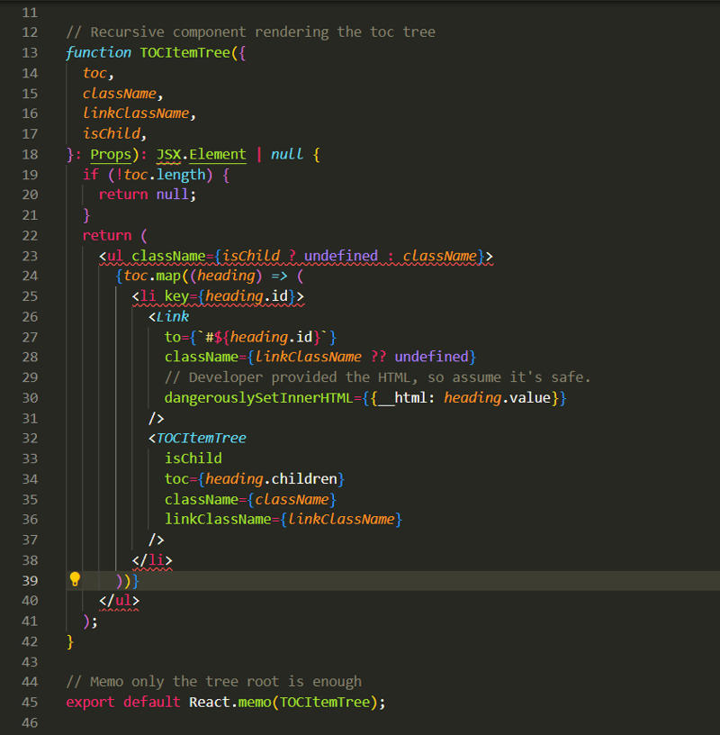
A recursive component!

At first, I couldn't belive what I saw. I always knew these treeviews and TOCs should have a tree data structure under the hood, but never thought the UI was also done in a tree style recusrive fashion. This was the most interesting thing I had found so far in Docusaurus, and I am glad to pick this feature.
Another interseting thing I found was the consistent use of clsx library throughout the codebase.
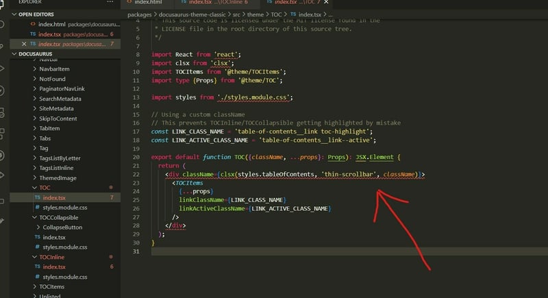
I had never heard of this library before, but on a quick chat with the one and only - ChatGPT, I found that it was one of the libraries I was always looking for.
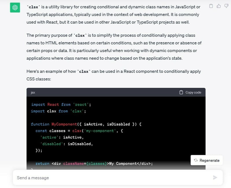
I learnt React in my college's web422 course, which was not long ago, and always wondered if there was a better way to add customized classnames in the jsx.
I have a lot of experience with Angular from my coop, and that framework has multiple powerfull strategies to configure styles/classes - NgStyle, NgClass, and interpolation to name a few.
Angular is better than React, change my mind in comments!
PS: Just my opinion, both are great technologies. And everyone might have different favourites.
Here's an article for a neutral comparison.
Angular vs React: Which One to Choose for Your App
But anyways, finding something powerfull for this purpose in React was really nice - more weapons in my arsenal now.
Conclusion 🎇
And that is a summary of my findings when looking into docusaurus' code for ideas and inspiration. I learnt about various unexpected concepts/tools like recursive components, clsx library and some ideas to organize projects.
I'll be following up with a post soon, about how I add this feature to my own project.
In the meantime, stay tuned!