 Brijesh Dobariya
React UI component libraries are collections of pre-built, reusable components that you can use to build your React applications more efficiently and with a consistent design. These libraries offer a wide range of components, such as buttons, forms, modals, and navigation bars, which can significantly speed up the development process.
Benefits of Using React Component Libraries
- Speed and Efficiency: Using react component libraries can drastically reduce the time it takes to build and deploy applications.
- Consistency: They help maintain a consistent look and feel across your application.
- Customizability: Most libraries allow for customization, enabling you to tweak the design to fit your needs.
- Community and Support: Popular component libraries have large communities and good documentation, making it easier to find help and resources.
Best Component Libraries –
Material-UI (MUI) –
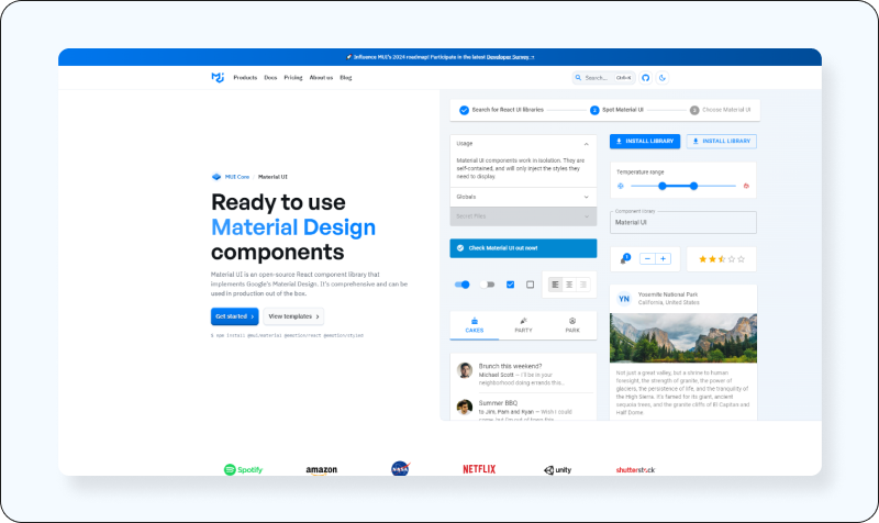
Implements Google’s Material Design, offering a wide range of components for efficient UI development.
- Features: Material-UI provides a wide range of components that follow Material Design guidelines.
- Benefits: It offers a consistent and attractive UI with accessibility baked in.
- Use Cases: Ideal for building high-quality, visually appealing web applications.
- GitHub Stars: Over 70K stars.
- Downloads: Millions of downloads monthly.
- Official Website: https://mui.com/material-ui/
Ant Design
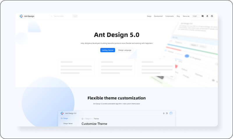
A design system for enterprise-level products, providing high-quality React components.
- Features: An enterprise-grade UI design language and React component library.
- Benefits: Offers a plethora of high-quality components and an internationalisation feature for global products.
- Use Cases: Suitable for developing complex web applications.
- GitHub Stars: Over 89.3k stars.
- Downloads: Over 600K weekly downloads.
- Official Website: https://ant.design/
React Bootstrap
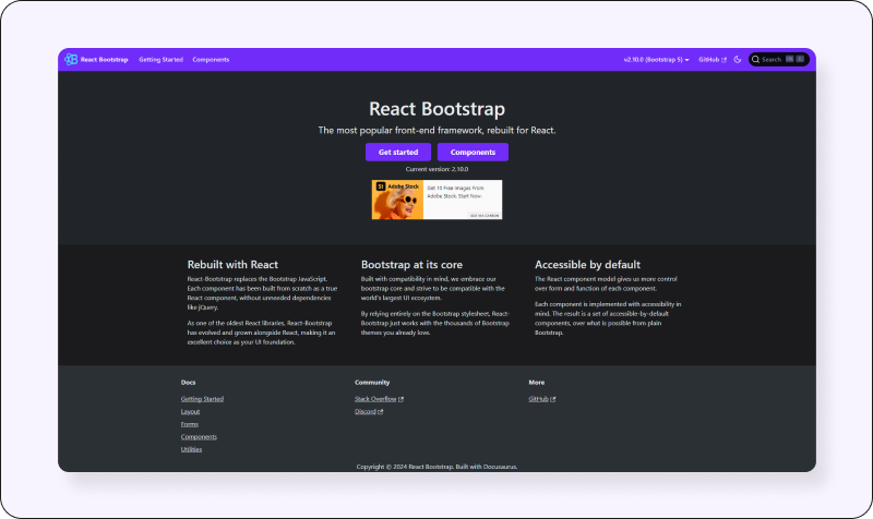
Integrates Bootstrap with React, allowing for the use of Bootstrap components as React components.
- Features: Rebuilds of Bootstrap components with React.
- Benefits: It combines the simplicity of Bootstrap with React’s power without jQuery.
- Use Cases: Great for users familiar with Bootstrap looking to integrate with React projects.
- GitHub Stars: Over 20K stars.
- Downloads: Over 1 million weekly downloads.
- Official Website: https://react-bootstrap.netlify.app/
Chakra UI
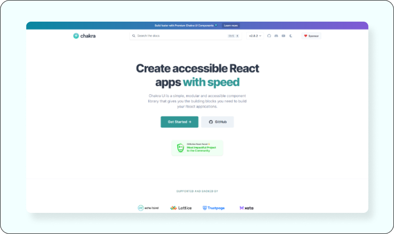
A simple, modular, and accessible component library that emphasizes ease of use and flexibility.
- Features: A simple, modular and accessible component library.
- Benefits: Emphasizes ease of styling and theme-ability.
- Use Cases: Excellent for building accessible websites and applications quickly.
- GitHub Stars: Over 25K stars.
- Downloads: Over 500K weekly downloads.
- Official Website: https://chakra-ui.com/
Blueprint UI
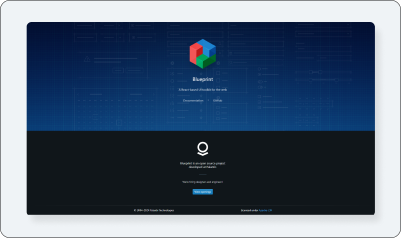
Focuses on data-dense interfaces for desktop applications, offering a comprehensive set of components.
- Features: Specifically designed for building complex data-dense interfaces.
- Benefits: Offers components that are highly customizable for building rich user interfaces.
- Use Cases: Ideal for enterprise applications, particularly in financial or resource management domains.
- GitHub Stars: Over 18K stars.
- Downloads: Over 100K weekly downloads.
- Official Website: https://blueprintjs.com/
PrimeReact
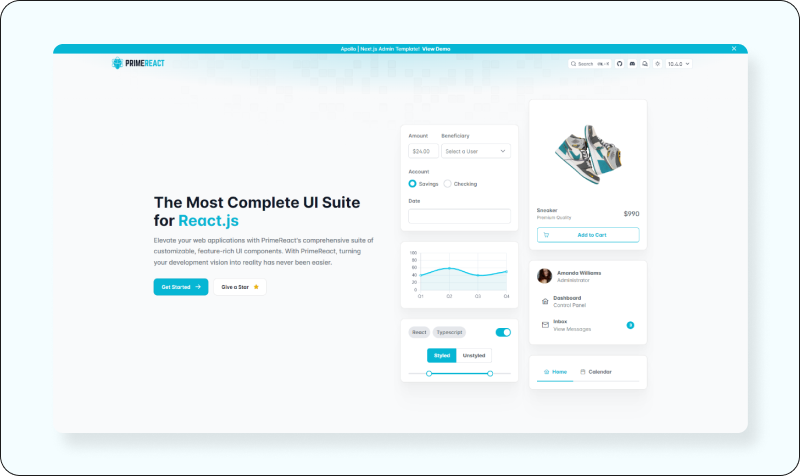
Offers a rich collection of components with themes and templates, enhancing UI and UX development.
- Features: Offers a collection of rich UI components.
- Benefits: Provides themes and templates, along with accessibility support.
- Use Cases: Versatile for any web application, from business to entertainment platforms.
- GitHub Stars: Over 5K stars.
- Downloads: Over 200K weekly downloads.
- Official Website: https://primereact.org/
Next UI
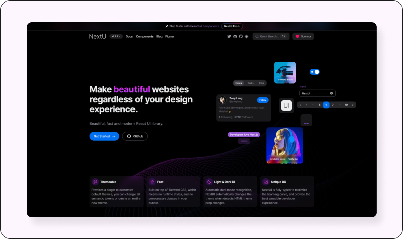
A newer, modern UI library with a focus on design and ease of use for creating visually appealing interfaces.
- Features: A next-generation UI library with beautiful designs and animations.
- Benefits: Focuses on modern UI trends and ease of use.
- Use Cases: Best for building futuristic, visually stunning web applications.
- GitHub Stars: Over 18K stars.
- Downloads: Data not available.
- Official Website: https://nextui.org/
React Suite
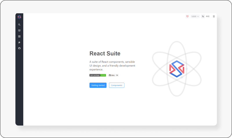
A comprehensive suite of components designed for web application development supports both light and dark themes.
- Features: A comprehensive suite of components for web application development.
- Benefits: Includes a range of tools and components that support RTL languages and dark mode.
- Use Cases: Suitable for enterprise back-end products.
- GitHub Stars: Over 6K stars.
- Downloads: Over 100K weekly downloads.
- Official Website: https://rsuitejs.com/
visx
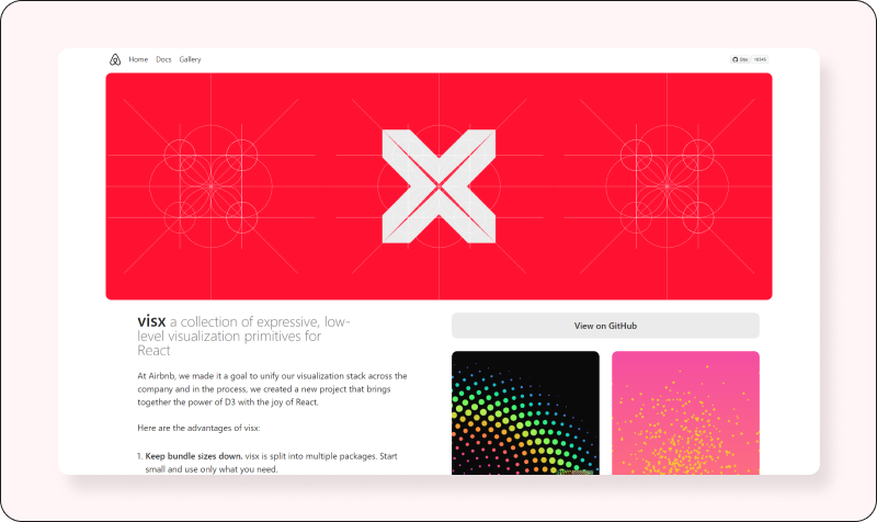
A collection of low-level visualization primitives for React, built on D3, allows for the creation of custom visualizations.
- Features: A collection of expressive, low-level visualization primitives for React.
- Benefits: Leverages D3 for complex visualizations with the benefits of React’s UI abstraction.
- Use Cases: Ideal for creating custom charts and data visualizations.
- GitHub Stars: Over 14K stars.
- Downloads: Over 100K weekly downloads.
- Official Website: https://airbnb.io/visx/
Semantic UI React
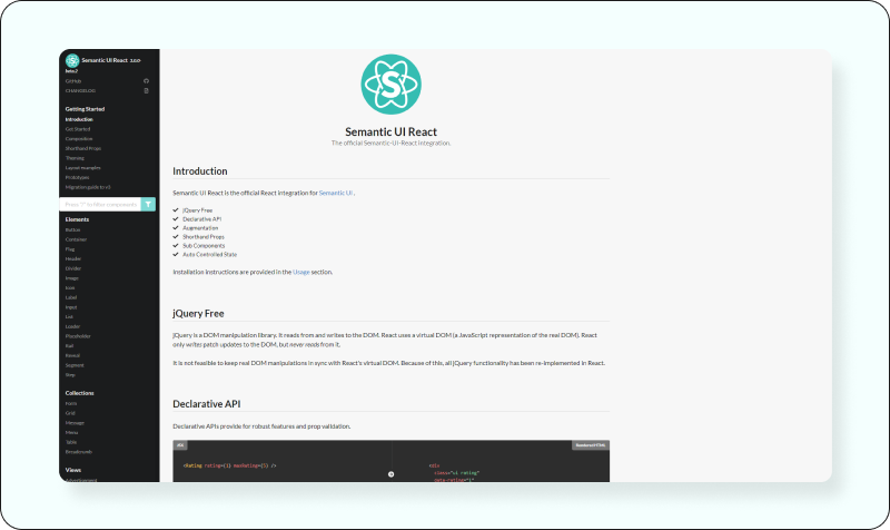
The official React integration for Semantic UI, focusing on simplicity and integration with other libraries.
- Features: The official React integration for Semantic UI.
- Benefits: It’s straightforward to use and integrates well with other libraries.
- Use Cases: Great for developers looking for a semantic way of building their UI.
- GitHub Stars: Over 12K stars.
- Downloads: Over 400K weekly downloads.
- Official Website: https://react.semantic-ui.com/
Fluent
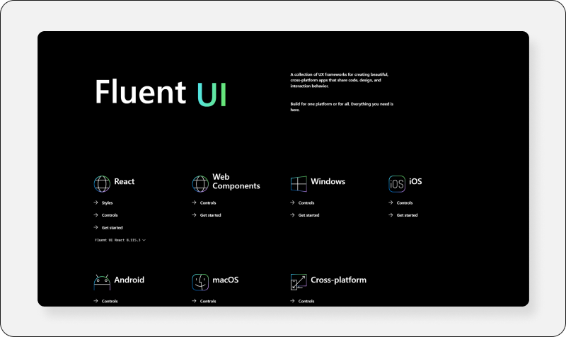
Developed by Microsoft, it provides a collection of components designed to create web experiences that align with Microsoft’s design principles.
- Features: Developed by Microsoft, it offers a set of web components.
- Benefits: It integrates well with Microsoft’s design language, offering coherent UI across the web and desktop.
- Use Cases: This is especially useful for projects aiming for consistency with Microsoft’s ecosystem.
- GitHub Stars: Over 17K stars.
- Downloads: Data not available.
- Official Website: https://developer.microsoft.com/en-us/fluentui#/
Onsen UI
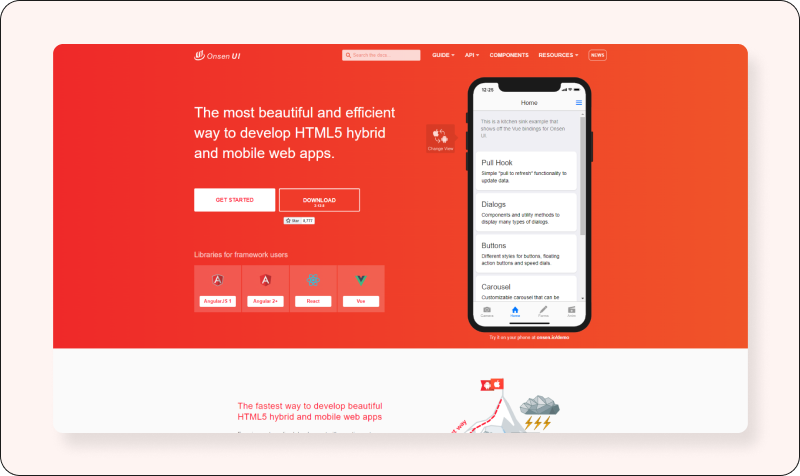
A mobile UI framework for building HTML5 mobile apps using web technologies, optimized for both Android and iOS.
- Features: Focuses on mobile web and hybrid apps.
- Benefits: It offers a wide variety of components that are performant and easy to use on mobile devices.
- Use Cases: Ideal for building mobile applications or progressive web apps (PWAs).
- GitHub Stars: Over 8K stars.
- Downloads: Data not available.
- Official Website: https://onsen.io/
React-admin
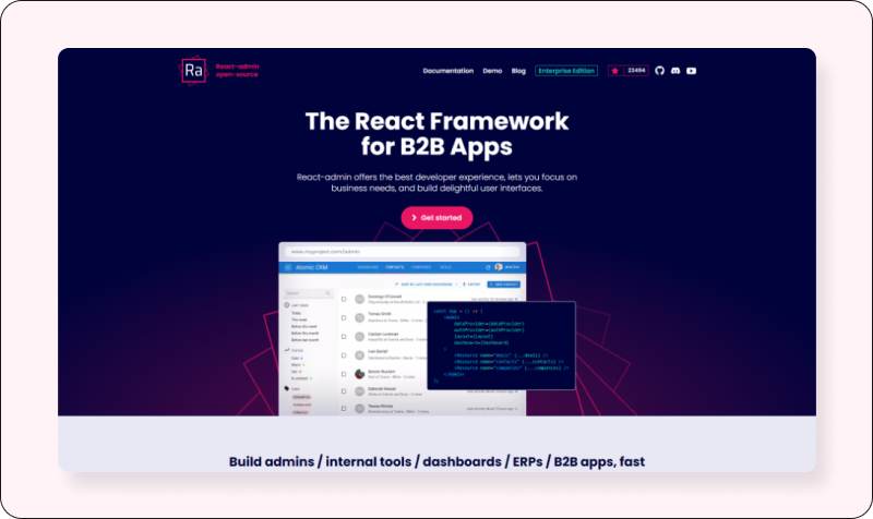
A framework for building B2B applications with pre-built components and tools for rapid development of admin panels.
- Features: A framework for building B2B applications on top of REST/GraphQL APIs.
- Benefits: Speeds up development with pre-built pages and a powerful data management model.
- Use Cases: Best for building admin panels, B2B applications, and dashboards.
- GitHub Stars: Over 22K stars.
- Downloads: Over 100K weekly downloads.
- Official Website: https://marmelab.com/react-admin/
Retool
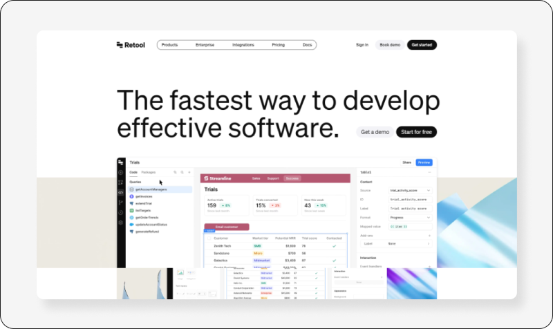
Offers a platform to quickly build internal tools with pre-built components, aiming at reducing development time.
- Features: Not a traditional component library but a tool to quickly build internal tools.
- Benefits: Offers pre-built components and connects to any database or API.
- Use Cases: Ideal for creating custom internal tools with minimal coding.
- GitHub Stars: Not applicable.
- Downloads: Not applicable.
- Official Website: https://retool.com/
Grommet
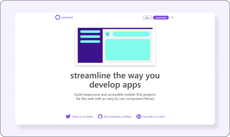
A React-based framework that provides accessibility, modularity, responsiveness, and themes in a compact package.
- Features: Focuses on mobile-first and accessible components.
- Benefits: Offers a rich set of components and tools for responsive and accessible design.
- Use Cases: Great for building responsive web applications aiming for high accessibility standards.
- GitHub Stars: Over 7K stars.
- Downloads: Over 50K weekly downloads.
- Official Website: https://v2.grommet.io/
Tailwind UI
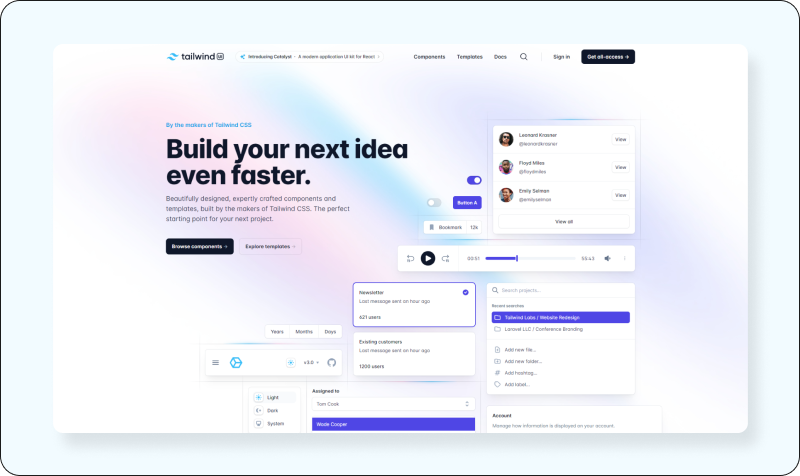
Not a traditional component library but a collection of UI components built with Tailwind CSS, focusing on customizability and design efficiency.
- Features: A component library built on top of Tailwind CSS framework.
- Benefits: Leverages Tailwind’s utility-first CSS approach for highly customizable components.
- Use Cases: Best for developers who prefer utility-first CSS and want to rapidly build custom designs.
- GitHub Stars: Not specified.
- Downloads: Not applicable as it’s more of a design system.
- Official Website: https://tailwindui.com/
Core UI
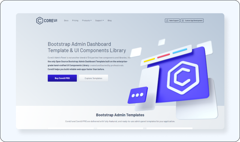
Offers a set of free and bootstrap admin templates and components for creating responsive admin panels.
- Features: Offers a set of free Bootstrap admin templates.
- Benefits: Provides a solid foundation for admin dashboards with extensibility.
- Use Cases: Suitable for building admin panels and dashboards with a Bootstrap base.
- GitHub Stars: Over 10K stars.
- Downloads: Over 10K weekly downloads.
- Official Website: https://coreui.io/
Mantine
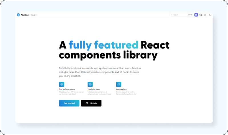
A modern component library focusing on ease of use, customization, and developer experience, with a strong emphasis on design and functionality.
- Features: A modern set of components with a focus on usability and customization.
- Benefits: Emphasizes developer experience with hooks, themes, and customization options.
- Use Cases: Ideal for developers looking for a flexible, modern UI toolkit.
- GitHub Stars: Over 10K stars.
- Downloads: Over 100K weekly downloads.
- Official Website: https://ui.mantine.dev/
Each library offers unique features and benefits, making them suitable for various use cases. When choosing a component library, consider the design system, customization needs, and the community/support around it to ensure it fits your project requirements.
Officially publish on - https://blog.codedthemes.com/


