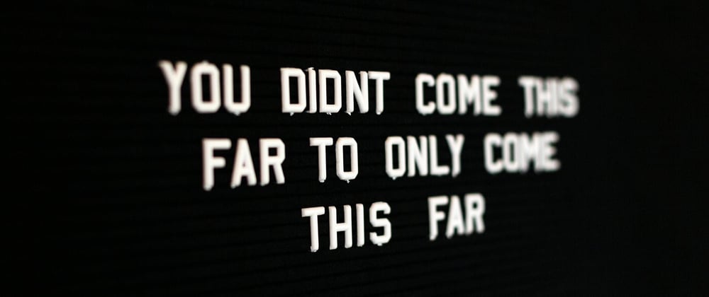
alt="A black background with the words, 'You didn't come this far to only come this far in a white font.'"
That alternative text describes the header image. Now if you can see that, then you know what the picture is and what message it is trying to convey. Low-vision users and Blind people won't.
So why is having alternative text so important? There are reasons why. If you have seen the tweets that are put out there that have images and no alt text to go along with the images, then you have undoubtedly seen someone from the accessibility space imploring people to use alt text.
I'm here to tell you why. Because it matters.
- Screen reader users depend on it.
- Persons with visual or cognitive disabilities depend on it.
- Everyone depends on it when an image does not load.
Those are reasons good enough to include alt text in your images.
But what if I don't want to be bothered with having to write something for every image that is in this... (site, project, my tweets)?
Do it. It doesn't take more than five minutes of your time. A clear and concise description of the image and what it is conveying is more than enough. It's inclusive, it's accessible, and it's the right thing to do.
Decorative Images
Just add an empty/null alt text and you're good to go. Easy as that.
Infographics, Graphs, and Charts. Oh my!
For these, you want to add clear labels, have good color contrast on shapes, allow for text to be zoomed, and provide a text alternative for Blind users using an accessible HTML table.
Please...
In the end, all I can ask is for people to use alt text in their images, practice inclusion and empathy, and make things more accessible. We can all benefit in the long run.
Photo by Drew Beamer on Unsplash


