 Jatin Sharma
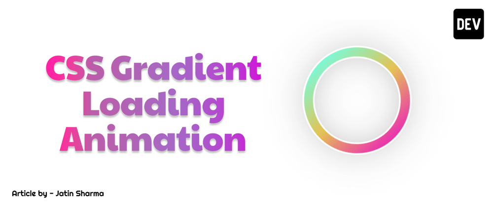
 In this article we are gonna build a loading spinner for you website stay tuned for that first let's look what are we building -

We just need simple div to create this animation. For this animation we have used pseudo classes and a normal keyframe in which we just rotate the div.
HTML
<div class="loader"></div>
CSS
.loader {
  position: relative;
  width: 200px;
  height: 200px;
  border-radius: 10rem;
  border: 3px solid white;
  background: linear-gradient(#eb31b0, #e4c352, #7df8d6);
  box-shadow: 0px 0px 100px -50px black;
  animation: animate 1s linear infinite;
}

.loader::before {
  position: absolute;
  content: "";
  background: #fff;
  left: 50%;
  top: 50%;
  transform: translate(-50%, -50%);
  width: 80%;
  height: 80%;
  border-radius: 10rem;
  border: 3px solid white;
  box-shadow: inset 0px 0px 100px -70px #111;
}

@keyframes animate {
  from {
    transform: rotate(0deg);
  }
  to {
    transform: rotate(360deg);
  }
}
Codepen is Here
Conclusion
So after that you can use it anywhere in your project. And let me know what do you think about it. If you like it then consider a follow.