 Lucas Olivera
The main reason I wanted to learn CSS was because I was very interested in Responsive Web Design. I tried to use the 'float' method until I discovered it was a bit outdated and there were better options for a web layout.
I started using Flexbox to organize my layout. Until I discovered CSS Grid. But I was confused as Flexbox and CSS Grid are very similar and I didn't know when to use which. So, let me tell you what I learnt from my new research.
The main difference
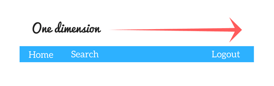
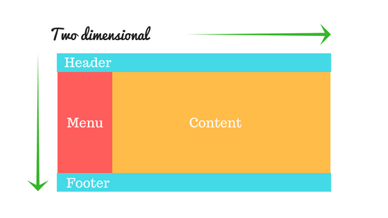
"Flexbox is made for one dimensional layouts and Grid is made for two dimensional layouts."
More differences
- CSS Grid’s approach is layout-first while Flexbox’s approach is content-first.
- Flexbox layout is most appropriate to the components of an application and small-scale layouts, while the Grid layout is intended for larger scale layouts which aren’t linear in their design.
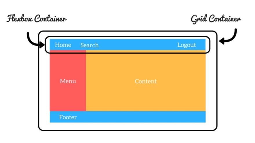
- Tip: You can even combine these layout models. Note that you can use a Flexbox container inside a CSS Grid container (and vice-versa too!).
Examples
I created some time ago a tribute page as a project for the FreeCodeCamp curriculum. Fully responsive and made with Flexbox, in case you want to check how to use it.
Edit: I also made the same project with CSS Grid, check it out.
Practice both!
Thomas Park has created two cute games to learn and practice Flexbox and CSS Grid.
When I have doubts
CSS Tricks has simple guides to use Flexbox and CSS Grid. I check them everytime I have a doubt or don't remember syntax.
Browser Compatibility
You can check which browsers support Flexbox here. Check here for CSS Grid compatibility.
Also check implementing CSS grid in Internet Explorer
Sources
Thoughts
Which one do you use the most?
Thank you for reading. Don't forget to follow me on dev.to and Twitter!