 Roeland
I was looking for a CSS framework that could be used for React and server side rendering. Tailwind is the most used option, but sometimes I just want to use some existing components to get started more quickly. But most React frameworks don't really work yet with server rendering.
A very good CSS framework already exists, Bootstrap. Why not use that?
The javascript part of Bootstrap is not very composable with React, but there is also a good existing framework for React Components, Headless UI.
The instructions below are for combining those in Next.js. I use plain Bootstrap classes for server rendering and Headless UI for more complex client components.
Install Next.js 13 with Bootstrap 5
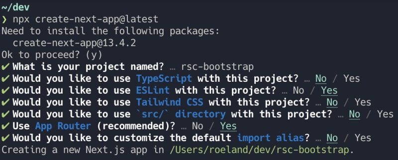
First install Next.js:
npx create-next-app@latest
Now add bootstrap:
npm install bootstrap
Next.js has support for sass.
npm install --save-dev sass
Create a styles folder in the root and add sassOptions in next.config.js:
const path = require("path");

/** @type {import('next').NextConfig} */
const nextConfig = {
  sassOptions: {
    includePaths: [path.join(__dirname, "styles")],
  },
};

module.exports = nextConfig;
In that styles folder create a new file bootstrap.scss with content like this:
$theme-colors: (
  'primary': #7a45d0bf,
);
$enable-cssgrid: true;
@import '/node_modules/bootstrap/scss/bootstrap.scss';
$theme-colors is for overriding bootstrap default colors.
$enable-cssgrid: true; for the new grid system
Let's use bootstrap now. Import the new stylesheets in app/layout.js.
import "../styles/bootstrap.scss";
import "./globals.css";
Remove the existing styles in app/globals.css and app/page.module.css.
Now replace the content of app/page.js with this:
export default function Home() {
  return (
    <div className="container grid gap-3 mt-3">
      <button className="btn btn-primary">Bootstrap button</button>
    </div>
  );
}
You now have a bootstrap button with a custom color.
Headless UI
Add Headless UI now:
npm install @headlessui/react
As an example I will implement the bootstrap accordion with the disclosure from Headless UI.
Create a new file components/Accordion.jsx,
components is a new folder in the root folder.
Let's add the example from the Headless UI website:
import { Disclosure } from "@headlessui/react";

export default function Accordion() {
  return (
    <Disclosure>
      <Disclosure.Button className="py-2">
        Is team pricing available?
      </Disclosure.Button>
      <Disclosure.Panel className="text-gray-500">
        Yes! You can purchase a license that you can share with your entire
        team.
      </Disclosure.Panel>
    </Disclosure>
  );
}
Now in app/page.jsx use this new component:
import Accordion from "@/components/Accordion";

export default function Home() {
  return (
    <div className="container grid gap-3 mt-3">
      <button className="btn btn-primary g-col-12">Bootstrap button</button>
      <div className="g-col-12">
        <Accordion />
      </div>
    </div>
  );
}
Now you get an error:
You're importing a component that imports client-only. It only works in a Client Component but none of its parents are marked with "use client", so they're Server Components by default.
The solution is easy. Add "use client"; at the top of components/Accordion.jsx
You have a working accordion now, but not themed.
Theming the accordion
Add bootstrap classes:
"use client";

import { Disclosure } from "@headlessui/react";

export default function Accordion() {
  return (
    <div className="accordion">
      <Disclosure>
        <div className="accordion-item">
          <h2 className="accordion-header">
            <Disclosure.Button className="accordion-button">
              Is team pricing available?
            </Disclosure.Button>
          </h2>
          <Disclosure.Panel className="accordion-collapse">
            <div className="accordion-body">
              Yes! You can purchase a license that you can share with your
              entire team.
            </div>
          </Disclosure.Panel>
        </div>
      </Disclosure>
    </div>
  );
}
It kind of works, but the arrow is not changing on opening/collapsing.
Whe can use the open render prop for this:
"use client";

import { Disclosure } from "@headlessui/react";

export default function Accordion() {
  return (
    <div className="accordion">
      <Disclosure>
        {({ open }) => (
          <div className="accordion-item">
            <h2 className="accordion-header">
              <Disclosure.Button
                className={`accordion-button ${open ? "" : "collapsed"}`}
              >
                Is team pricing available?
              </Disclosure.Button>
            </h2>
            <Disclosure.Panel className="accordion-collapse">
              <div className="accordion-body">
                Yes! You can purchase a license that you can share with your
                entire team.
              </div>
            </Disclosure.Panel>
          </div>
        )}
      </Disclosure>
    </div>
  );
}
This works. Now add an extra disclosure for the final result:
"use client";

import { Disclosure } from "@headlessui/react";

export default function Accordion() {
  return (
    <div className="accordion">
      <Disclosure>
        {({ open }) => (
          <div className="accordion-item">
            <h2 className="accordion-header">
              <Disclosure.Button
                className={`accordion-button ${open ? "" : "collapsed"}`}
              >
                First item
              </Disclosure.Button>
            </h2>
            <Disclosure.Panel className="accordion-collapse">
              <div className="accordion-body">
                This is the content of the first item.
              </div>
            </Disclosure.Panel>
          </div>
        )}
      </Disclosure>

      <Disclosure>
        {({ open }) => (
          <div className="accordion-item">
            <h2 className="accordion-header">
              <Disclosure.Button
                className={`accordion-button ${open ? "" : "collapsed"}`}
              >
                Second item
              </Disclosure.Button>
            </h2>
            <Disclosure.Panel className="accordion-collapse">
              <div className="accordion-body">
                This is the content of the second item.
              </div>
            </Disclosure.Panel>
          </div>
        )}
      </Disclosure>
    </div>
  );
}
You should now have something like this:

This is just an example. You can make this component more reusable by adding props for the content. This makes it useable from server components like explained here