Storybook Addon AngularJS (1.x)

Tito - Aug 26 '18 - - Dev Community

A few weeks ago I published the package storybook-addon-angularjs to help create stories for Storybook with AngularJS components.

Features:

  • Simple syntax
  • Supports integration with other addons like knobs and actions

The Tweet with the first announcement and a small screen capture:

Liquid error: internal

Creating a story with an AngularJS component is as simple as this:

import { storiesOf } from "@storybook/html";

import { withKnobs, text, number } from "@storybook/addon-knobs";
import { action } from "@storybook/addon-actions";

import { forModule } from "storybook-addon-angularjs";

storiesOf("Components/Demo", module)
  .addDecorator(withKnobs)
  .add(
    "default",
    forModule("myApp").createElement(compile => {
      const name = text("Name", "Jane");

      const foo = {
        bar: number("Value", 20, { range: true, min: 0, max: 30, step: 1 })
      };

      const onEvt = action("clicked");

      return compile`<demo-component
                       name="${name}"
                       foo="${foo}"
                       on-ev="${onEvt}(num, name)"></demo-component>`;
    })
  );
Enter fullscreen mode Exit fullscreen mode

This depends on Storybook 4+ and the HTML Addon.

The code for the addon:

GitHub logo titonobre / storybook-addon-angularjs

A simple addon to create Storybook stories with AngularJS components.

Storybook Addon for AngularJS (1.x)

npm npm GitHub issues GitHub Storybook

Note This addon is intended to be used with @storybook/html, available since Storybook 4.

Installation

Use your favorite 📦 package manager to install the addon in your project's devDependencies:

npm:

npm install --save-dev storybook-addon-angularjs
Enter fullscreen mode Exit fullscreen mode

Yarn:

yarn add --dev storybook-addon-angularjs
Enter fullscreen mode Exit fullscreen mode

Usage

This addon is flexible enough to let you choose how you want to write stories.

Your stories can be as simple as this:

export default {
  title: "QuoteCard",
  decorators: [withAngularJs("myApp")],
};
export const simpleTemplate = () => `
  <quote-card author="'Me'">
    It works with a simple template!
  </quote-card>
`;
Enter fullscreen mode Exit fullscreen mode

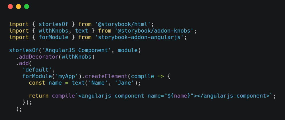
But you may choose something more advanced:

import { withKnobs, text } from "@storybook/addon-knobs";
import { action } from "@storybook/addon-actions";
import { html, withAngularJs } from "storybook-addon-angularjs";
class MockedAppService {
  constructor() {
    this.message =
Enter fullscreen mode Exit fullscreen mode

A working example:

GitHub logo titonobre / storybook-addon-angularjs-example

A working example with storybook-addon-angularjs. Moved to: https://github.com/titonobre/storybook-addon-angularjs


Feedback is appreciated.
Thanks for reading.

. .
Terabox Video Player