
 Thomas Künneth
Welcome to the seventh part of Understanding foldable devices. It's been almost six months since the previous instalment, Foldable-aware app layout, went live. Quite a few things have happened. First, the Google Pixel Fold is here. Although it comes with a hefty price tag, it will hopefully drive interest in this still new device category. Second, Google's most important apps are starting to look good on large screens. Which brings us to... third, there's also the Pixel Tablet, so Google is finally back in the tablet game.
There's also a not so nice thing: it now is pretty clear that Microsoft lost interest in its Surface Duo and Surface Duo 2 foldables. But often, when vendors fail, the community jumps in. Here, this is the case, too. Thai Nguyen, a software engineer who in the past has worked at Microsoft, released a couple of Android 13 builds for the Surface Duo and the Duo 2. The builds are based on PixelExperience, an AOSP based ROM with Google apps and all Pixel goodies included. What's important, Thai makes use of the foldable features of the Duos in a way really close to the Pixel Fold. If you have a Surface Duo or Duo 2, have a look at the corresponding XDA thread to get started.
compose_adaptive_scaffold
To make writing apps that look great on foldables and large screens as easy as possible, I started an open source library called compose_adaptive_scaffold. You can find it in the Google Dev Library and on GitHub.
compose_adaptive_scaffold is based on the idea of two panes, called body and secondary body. For small screens you pass alternatives (or variations) called small body and small secondary body (the latter one is optional). Depending on your screen layout, the pairs body and small body, and secondary body and small secondary body may even be the same. Two panes are the basis for Canonical Layouts, an important Material Design concept. Before I show you how easy it is to create the panes, I'd like to mention that compose_adaptive_scaffold is inspired by the Flutter package flutter_adaptive_scaffold.
To use compose_adaptive_scaffold, you just need to add it as an implementation dependency:
dependencies {
  implementation "com.github.tkuenneth:compose_adaptive_scaffold:0.2.1"
}
Next, let's look at the activity.
class AdaptiveScaffoldDemoActivity : ComponentActivity() {
  override fun onCreate(savedInstanceState: Bundle?) {
    super.onCreate(savedInstanceState)
    lifecycleScope.launch {
      lifecycle.repeatOnLifecycle(Lifecycle.State.STARTED) {
        setContent {
          …
          MaterialTheme(
            content = {
              …
            },
            colorScheme = defaultColorScheme()
          )
        }
      }
    }
  }
}
launch and repeatOnLifecycle are needed to get the underlying machinery (Jetpack WindowManager) going. A future version of my library might even do this for you. defaultColorScheme() is a nice little helper that gives your app Dark mode support and dynamic colours on supported systems.
Here's how content is defined:
content = {
  AdaptiveScaffold(
    useDrawer = true,
    startDestination = destination1,
    otherDestinations = listOf(destination2),
    onDestinationChanged = {
      // do something
    },
    topBar = {
      TopAppBar(
        title = {
          Text(
            text = stringResource(
              id = R.string.app_name
            )
          )
        })
    },
  )
},
All magic is handled by a composable called AdaptiveScaffold(). Besides panes, it is based upon destinations. You pass a start destination, as well as a list of other destinations. Depending on the horizontal Window Size Class, compose_adaptive_scaffold uses a bottom navigation, a navigation rail, or a navigation drawer.
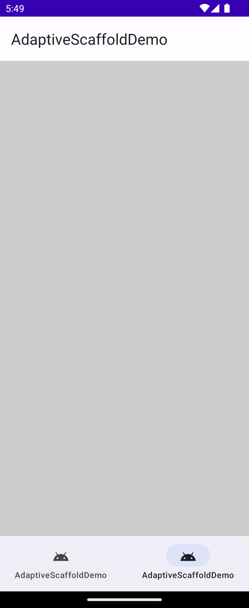
The following screenshot was taken on a simulated flip phone in portrait mode.

Here, the phone was rotated to landscape mode:

To understand why the colours have changed, let's look at the definition of destination1.
val destination1 = NavigationDestination(
  icon = R.drawable.ic_android_black_24dp,
  label = R.string.app_name,
  body = {
    Box(
      modifier = Modifier
        .fillMaxSize()
        .background(color = Color.Red)
    )
  },
  secondaryBody = {
    Box(
      modifier = Modifier
        .fillMaxSize()
        .background(color = Color.Green)
    )
  },
  smallBody = {
    Box(
      modifier = Modifier
        .fillMaxSize()
        .background(color = Color.Blue)
    )
  },
  smallSecondaryBody = {
    Box(
      modifier = Modifier
        .fillMaxSize()
        .background(color = Color.Yellow)
    )
  },
)
So, a NavigationDestination gets an icon, a label, and two pairs describing the panes:
- body and secondary body
- small body and small secondary body
Spanning panes
A destination may also receive an overlay.
val destination2 = NavigationDestination(
  icon = R.drawable.ic_android_black_24dp,
  label = R.string.app_name,
  overlay = {
    Box(
      modifier = Modifier
        .fillMaxSize()
        .background(color = Color.LightGray)
    )
  },
)
Here we don't provide any pane. What's that useful for?
An overlay spans the two panes, it is laid out on top of them. In my example the panes are empty and the overlay uses all available space, but you can also make the overlay smaller, so it floats above the panes.
What's next?
compose_adaptive_scaffold is still in its infancy. I need to explore how to use it with canonical layouts. Also, combining the library with existing navigation frameworks is on the to do list. What else am I missing? And how do you like the general idea? Please share your thoughts in the comments.


