 Chrissie
In the first part, I wrote about flexbox properties that affected the flex container. In this second part, I'll be giving you flexbox properties that affect the flex items along with how they work.
I'll be using the same pen that I used for part one.
<div class="container">
   <div class="one">1</div>
   <div class="two">2</div>
   <div class="three">3</div>
   <div class="four">4</div>
</div>
.container{
display: flex;
}

.one, .two, .three, .four {
  background-color: #f5f
  padding: 2rem;
  font-size: 2rem;
}
The main properties are:
- Order
- Flex-grow
- Flex-shrink
- Flex-basis
- Flex
- Align-self
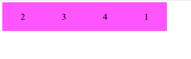
Order
This property specifies the order in which the flex items will be displayed. By default, the items are displayed in the order in which they were written in the source code but with this property, you can change the order of the items.
.one{
 order: 4
}
Flex-grow
This property specifies how much an item should grow or expand to fit the space available. If you give an item the flex-grow value of 2, that will item will take up twice as much space as the other elements in the container.
.one{
 flex-grow:2
}

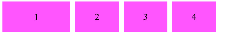
Flex-shrink
This property unlike flex-grow will specifies how much an item will shrink to fit the space available.
.one{
 flex-shrink: 5
}
As you can see in this image, the first item is much smaller than the rest of the items.
Flex-basis
This property specifies the initial or default value of an item before the space in the container is distributed.
.one{
 flex-basis: 10rem;
}
Flex
This is the shorthand property for the flex-grow, flex-shrink, and flex-basis properties.
.one{
 flex: 0 0 10rem;
}

The first element will not grow, will not shrink, and will have an initial length of 10rem.
Align-self
This property works like align-items but is only applied to one item instead of the whole container.
.one{
 align-self: flex-start;
}

That's it! This concludes this mini-series about CSS flexbox for beginners. Hope it helped you understand flexbox better. If you have any questions or comments do it down below.


